pythonの描画ライブラリである「matplotlib」を用いて、グラフを複数表示する方法について紹介します。
本記事では、下記の内容を紹介しています。
この記事で分かること
- 複数のグラフを並べて表示する方法
- 複数のグラフを重ねて表示する方法
スポンサーリンク
matplotlibで複数のグラフを並べて表示する方法
はじめに、matplotlibで複数のグラフを並べて表示する方法について紹介します。
グラフを表示する領域をfigオブジェクトとして作成し、複数のグラフそれぞれの領域をsubplotとして指定することで、複数のグラフを並べて表示することができます。
以下、2つのグラフを上下に並べて表示するサンプルコードです。
### 2つのグラフを上下に並べて表示
import numpy as np
import matplotlib.pyplot as plt


x = np.linspace(0, 10, 1000)

y1 = np.sin(x)
y2 = np.cos(x)


c1, c2 = 'blue', 'green'
l1, l2 = 'sin', 'cos'

xl1, xl2 = 'x', 'x'
yl1, yl2 = 'sin', 'cos'


#グラフを表示する領域を,figオブジェクトとして作成。
fig = plt.figure(figsize = (10,6), facecolor='lightblue')

#グラフを描画するsubplot領域を作成。
ax1 = fig.add_subplot(2, 1, 1)
ax2 = fig.add_subplot(2, 1, 2)

#各subplot領域にデータを渡す
ax1.plot(x, y1, color=c1, label=l1)
ax2.plot(x, y2, color=c2, label=l2)

#各subplotにxラベルを追加
ax1.set_xlabel(xl1)
ax2.set_xlabel(xl2)

#各subplotにyラベルを追加
ax1.set_ylabel(yl1)
ax2.set_ylabel(yl2)

# 凡例表示
ax1.legend(loc = 'upper right')
ax2.legend(loc = 'upper right')

plt.show()
コード実行後、表示されるグラフはこちらになります。
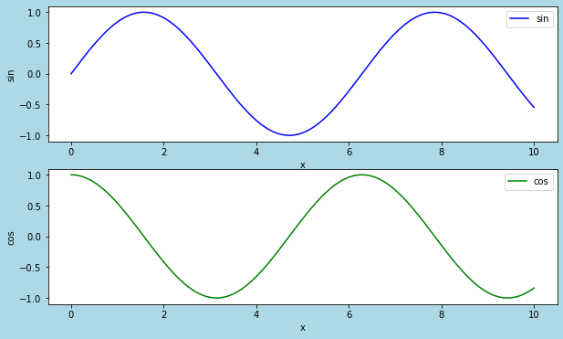
> fig = plt.figure(figsize = (10,6), facecolor='lightblue')
グラフを表示する領域を、figオブジェクトとして作成しています。
figsizeで領域の幅と高さを、facecolorで領域の色を指定しています。
> ax1 = fig.add_subplot(2, 1, 1)
> ax2 = fig.add_subplot(2, 1, 2)
figオブジェクトに、それぞれのグラフを描画するためのsubplotを追加しています。
引数には順番に、"行数"、”列数"、”位置”を指定します。
> ax1.plot(x, y1, color=c1, label=l1)
> ax2.plot(x, y2, color=c2, label=l2)
subplotに、データを渡しています。
colorでプロットの色、labelで凡例として表示される文字列を指定しています。
2つ以上のグラフを並べて表示する方法
前述の方法を拡張するだけで、2×2などでグラフを並べることも簡単に実現できます。
以下、2×2で4つのグラフを並べて表示するサンプルコードです。
### 4つのグラフを並べて表示
import numpy as np
import matplotlib.pyplot as plt


x = np.linspace(0, 10, 1000)

y1 = np.sin(x)
y2 = np.cos(x)
y3 = -np.sin(x)
y4 = np.sin(x)**2


c1,c2,c3,c4 = 'blue', 'green', 'red', 'black'
l1,l2,l3,l4 = 'sin', 'cos', '-sin', 'sin**2'

xl1, xl2, xl3, xl4 = 'x', 'x', 'x', 'x'
yl1, yl2, yl3, yl4 = 'sin', 'cos', '-sin', 'sin**2'


#グラフを表示する領域を,figオブジェクトとして作成.
fig = plt.figure(figsize = (10,6), facecolor='lightblue')

#グラフを描画するsubplot領域を作成。
ax1 = fig.add_subplot(2, 2, 1)
ax2 = fig.add_subplot(2, 2, 2)
ax3 = fig.add_subplot(2, 2, 3)
ax4 = fig.add_subplot(2, 2, 4)

#各subplot領域にデータを渡す
ax1.plot(x, y1, color=c1, label=l1)
ax2.plot(x, y2, color=c2, label=l2)
ax3.plot(x, y3, color=c3, label=l3)
ax4.plot(x, y4, color=c4, label=l4)

#各subplotにxラベルを追加
ax1.set_xlabel(xl1)
ax2.set_xlabel(xl2)
ax3.set_xlabel(xl3)
ax4.set_xlabel(xl4)

#各subplotにyラベルを追加
ax1.set_ylabel(yl1)
ax2.set_ylabel(yl2)
ax3.set_ylabel(yl3)
ax4.set_ylabel(yl4)

# 凡例表示
ax1.legend(loc = 'upper right')
ax2.legend(loc = 'upper right')
ax3.legend(loc = 'upper right')
ax4.legend(loc = 'upper right')


plt.show()
コード実行後、表示されるグラフはこちらになります。
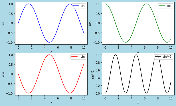
> ax1 = fig.add_subplot(2, 2, 1)
> ax2 = fig.add_subplot(2, 2, 2)
> ax3 = fig.add_subplot(2, 2, 3)
> ax4 = fig.add_subplot(2, 2, 4)
2行2列の、1、2、3、4の位置に、subplotを追加しています。
スポンサーリンク
matplotlibで複数のグラフを重ねて表示する方法
つぎに、matplotlibで、複数のグラフを重ねて表示する方法を紹介します。
先ほどの例のようにsubplotは追加せず、1つの領域にplot関数で複数のデータを渡すことで、グラフを重ねて表示することができます。
以下、サンプルコードになります。
### 複数のグラフを重ねて表示
import numpy as np
import matplotlib.pyplot as plt


x = np.linspace(0, 10, 1000)

y1 = np.sin(x)
y2 = np.cos(x)


c1, c2 = 'blue', 'green'
l1, l2 = 'sin', 'cos'

xl = 'x'
yl = 'y'


#グラフを表示する領域を,figオブジェクトとして作成.
fig = plt.figure(figsize = (6,4), facecolor='lightblue')

plt.plot(x, y1, color=c1, label=l1)
plt.plot(x, y2, color=c2, label=l2)

#ラベルを追加
plt.xlabel(xl1)
plt.ylabel(yl1)


# 凡例表示
plt.legend(loc = 'upper right')

plt.show()
コード実行後、表示されるグラフはこちらになります。
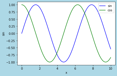
> plt.plot(x, y1, color=c1, label=l1)
> plt.plot(x, y2, color=c2, label=l2)
plot関数で、グラフ描画用のデータを追加しています。
スポンサーリンク
まとめ
matplotlibで、グラフに複数のデータを描画する方法について紹介しました。
matplotlibを使う上で、基本かつ必須の手法なので、覚えておくようにしましょう。
スポンサーリンク