This article shows how to plot data from Excel file.
Contents
◆How to plot data from Excel
- Using "matplotlib" and "openpyxl"
- Using "matplotlib" and "pandas"
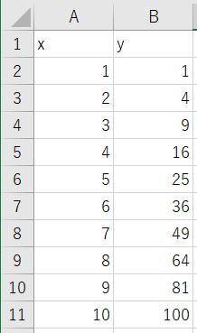
This is the Excel file of example code.
sponsored link
How to plot data from Excel using "matplotlib" and "openpyxl"
I show how to plot data from Excel by using "matplotlib" and "openpyxl".
This is the example code.
The data in the Excel file is read by using "openpyxl".
import openpyxl
import numpy as np
import pprint
import matplotlib.pyplot as plt
def get_value_list(t_2d):
return([[cell.value for cell in row] for row in t_2d])
def get_list_2d(sheet, start_row, end_row, start_col, end_col):
return get_value_list(sheet.iter_rows(min_row=start_row,max_row=end_row,min_col=start_col,max_col=end_col))
path_excel = r'test\test.xlsx'
wb = openpyxl.load_workbook(path_excel, data_only=True)
sh = wb['Sheet1']
data_excel = get_list_2d(sh, 1, 11, 1, 2)
wb.close
header = data_excel.pop(0)
data = np.float_(np.array(data_excel).T)
fig, ax = plt.subplots()
ax.plot(data[0], data[1], linestyle='solid', marker='o')
ax.set_xlabel(header[0])
ax.set_ylabel(header[1])
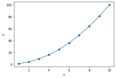
plt.show()The above code generates the following graph.
> def get_value_list(t_2d):
> return([[cell.value for cell in row] for row in t_2d])
>
> def get_list_2d(sheet, start_row, end_row, start_col, end_col):
> return get_value_list(sheet.iter_rows(min_row=start_row,max_row=end_row,min_col=start_col,max_col=end_col))
Define functions to read data from excel.
This function takes "worksheet", "start row", "end row", "start column", and "end column" as arguments and returns a list.
> wb = openpyxl.load_workbook(path_excel, data_only=True)
> sh = wb['Sheet1']
> data_excel = get_list_2d(sh, 1, 11, 1, 2)
> wb.close
The excel data is read by using the defined function.
Remember to close the workbook after use.
> header = rows.pop(0)
The 0th element of the csv data is retrieved by using "pop method".
> data = np.float_(np.array(data_excel).T)
The data is transformed into a form that can be plotted in a graph.
np.array(rows).T : After transforming into numpy type, it is transposed.
np.float_( ) : Transforms to floating type.
> ax.plot(data[0], data[1], linestyle='solid', marker='o')
The data is passed to the graph.
> ax.set_xlabel(header[0])
> ax.set_ylabel(header[1])
X-axis and Y-axis labels are specified.
How to use of "pop method" of a list is explained in this article.
Remove Elements from List [del, remove, pop, clear]
sponsored link
How to plot data from Excel using "matplotlib" and "pandas"
Next, I show how to read excel data by using "pandas" and draw a graph by using "matplotlib".
This is the example code.
The data in the excel file is read by using "pandas.read_excel" function.
import pandas as pd
import numpy as np
import pprint
import matplotlib.pyplot as plt


path_excel = r'test\test.xlsx'

df_excel = pd.read_excel(path_excel)

data_x = df_excel[df_excel.columns[0]]
data_y = df_excel[df_excel.columns[1]]


fig, ax = plt.subplots()

ax.plot(data_x, data_y, linestyle='solid', marker='o')

ax.set_xlabel(df_excel.columns[0])
ax.set_ylabel(df_excel.columns[1])

plt.show()
The above code generates the following graph.
> df_excel = pd.read_excel(path_excel)
The data in the Excel file is read using the "pandas.read_excel" function.
> data_x = df_excel[df_excel.columns[0]]
> data_y = df_excel[df_excel.columns[1]]
The data is transformed into a form that can be plotted in a graph.
The "df.columns" function is used to get the column names of the DataFrame.
The data corresponding to each of the X and Y axes is extracted by specifying "df_excel[ 'column name' ]".
sponsored link