This article shows how to plot a line chart in matplotlib.
Contents
- How to plot a line chart
- How to add markers to a line chart
- How to add values to a line chart
- How to add error bars to a line chart
- How to plot multiple line charts
- How to plot a line chart by using pandas
sponsored link
How to plot a line chart
In the beginning, I show how to plot a line chart.
Matplotlib provides methods for drawing a line chart.
The way to use of "matplotlib.pyplot.plot" is described in matplotlib documentation.
This is the example code to create a line chart using "matplotlib.pyplot.plot".
import matplotlib.pyplot as plt
import numpy as np
x = list(range(1,6))
y = np.random.rand(5)
fig, ax = plt.subplots()
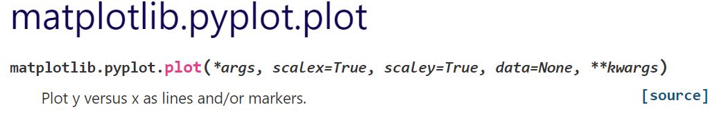
ax.plot(x, y)
plt.show()The above code generates the following graph.
> ax.plot(x, y)
The variables "x" and "y" are data lists for line chart generation.
Add legends and labels to graph
I show an example of adding legends and labels to graph.
This is the example code.
import matplotlib.pyplot as plt
import numpy as np
x = list(range(1,6))
y = np.random.rand(5)
fig, ax = plt.subplots()
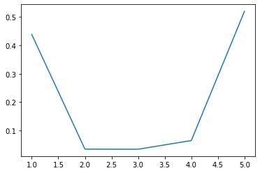
ax.plot(x, y, label = 'random')
ax.set_xlabel('X-label')
ax.set_ylabel('Y-label')
ax.set_title('Title')
ax.legend()
plt.show()The above code generates the following graph.
> ax.plot(x, y, label = 'random')
You can specify a string of legend by using "label=" argument.
The following article explains how to add legend to graph.
> ax.set_xlabel('X-label')
> ax.set_ylabel('Y-label')
Axis labels are added.
The following article explains how to set axis elements.
How to Set Axis Elements[Label, Range, Ticks]
> ax.set_title('Title')
Title is added.
The following article explains how to set axis elements.
How to Add a Title[Position, Size, Font]
sponsored link
How to add markers to a line chart
I show how to add markers to a line chart.
You can add markers to graph by using "marker=" argument.
This is the example code.
import matplotlib.pyplot as plt
import numpy as np
x = list(range(1,6))
y = np.random.rand(5)
fig, ax = plt.subplots()
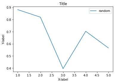
ax.plot(x, y, marker='o')
plt.show()The above code generates the following graph.
> ax.plot(x, y, marker='o')
Circular markers are added.
If you want to know more about marker types, please refer to the matplotlib documentation.
How to add values to a line chart
I show how to add values to a line chart.
You can add values to graph by using "ax.text( )".
Specify "x-coordinate", "y-coordinate", and "value" as the arguments of ax.text( ).
This is the example code.
import matplotlib.pyplot as plt
import numpy as np

x = list(range(1,6))
y = np.round(np.random.rand(5), 2)

fig, ax = plt.subplots()

ax.plot(x, y, marker='o')

ax.set_xlabel('X-label')
ax.set_ylabel('Y-label')

for i, value in enumerate(y):
    ax.text(x[i], y[i], value)

plt.show()
The above code generates the following graph.
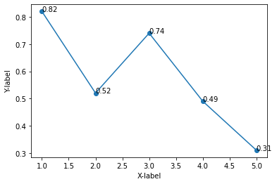
> for i, value in enumerate( y ):
> ax.text(x[ i ], y[ i ], value)
Use enumerate function to get the index and element from a list.
Specify "x-coordinate", "y-coordinate", and "value" are specified as the arguments.
The following article explains how to use enumerate function.
sponsored link
How to add error bars to a line chart
I show how to add error bars to a line chart.
You can add error bars to graph by using "ax.errorbar( )".
Specify "x-data", "y-data", and "error value" as the arguments of ax.errorbar( ).
This is the example code.
import matplotlib.pyplot as plt
import numpy as np

x = list(range(1,6))
y = np.round(np.random.rand(5), 2)
e = y*0.1

fig, ax = plt.subplots()

ax.plot(x, y, color='black')
ax.errorbar(x, y, yerr=e, marker='o', capthick=1, capsize=5, lw=1, color='black')

ax.set_xlabel('X-label')
ax.set_ylabel('Y-label')

plt.show()
The above code generates the following graph.
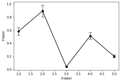
> e = y*0.1
The error value is assumed to be y multiplied by 0.1.
The value "e" is list type.
> ax.errorbar(x, y, yerr=e, marker='o', capthick=1, capsize=5, lw=1, color='black')
Error bars are added.
The error value "e" is specified by using "yerr=" argument.
[Supplement]How to add error bars with different lengths at the top and bottom
I show how to add error bars with different lengths at the top and bottom.
Specify "lower error value " and "upper error value" by using arguments "yerr=".
This is the example code.
import matplotlib.pyplot as plt
import numpy as np

x = list(range(1,6))
y = np.round(np.random.rand(5), 2)
e_l = y*0.05
e_u = y*0.1

fig, ax = plt.subplots()

ax.plot(x, y, color='black')
ax.errorbar(x, y, yerr=[e_l, e_u], marker='o', capthick=1, capsize=5, lw=1, color='black')

ax.set_xlabel('X-label')
ax.set_ylabel('Y-label')

plt.show()
The above code generates the following graph.
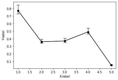
> e_l = y*0.05
> e_u = y*0.1
Create two lists of error values.
> ax.errorbar(x, y, yerr=[e_l, e_u], marker='o', capthick=1, capsize=5, lw=1, color='black')
Specify "lower error value " and "upper error value" by using arguments "yerr=".
How to plot multiple line charts
I show how to plot multiple line charts.
I show following two examples.
- How to plot multiple line charts on top of each other
- How to plot multiple line charts side by side
How to plot multiple line charts on top of each other
I show how to plot multiple line charts on top of each other.
This is the example code.
import matplotlib.pyplot as plt
import numpy as np

x = list(range(1,6))
y1 = np.random.rand(5)
y2 = np.random.rand(5)

fig, ax = plt.subplots()

ax.plot(x, y1, marker='o', color='blue', label='y1')
ax.plot(x, y2, marker='o', color='red', label='y2')

ax.set_xlabel('X-label')
ax.set_ylabel('Y-label')

ax.legend()

plt.show()
The above code generates the following graph.
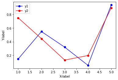
> ax.plot(x, y1, marker='o', color='blue', label='y1')
> ax.plot(x, y2, marker='o', color='red', label='y2')
Two line charts are drawn in the same "subplot" area.
How to plot multiple line charts side by side
I show how to plot multiple line charts side by side.
This is the example code.
import matplotlib.pyplot as plt
import numpy as np

x = list(range(1,6))
y1 = np.random.rand(5)
y2 = np.random.rand(5)

#グラフを表示する領域を,figオブジェクトとして作成.
fig = plt.figure(figsize = (10,6), facecolor='lightblue')

ax1 = fig.add_subplot(1, 2, 1)
ax2 = fig.add_subplot(1, 2, 2, sharey=ax1)

ax1.plot(x, y1, marker='o', color='blue', label='y1')
ax2.plot(x, y2, marker='o', color='red', label='y2')

ax1.set_xlabel('X-label')
ax1.set_ylabel('Y-label')
ax2.set_xlabel('X-label')
ax2.set_ylabel('Y-label')

ax1.legend()
ax2.legend()

plt.show()
The above code generates the following graph.
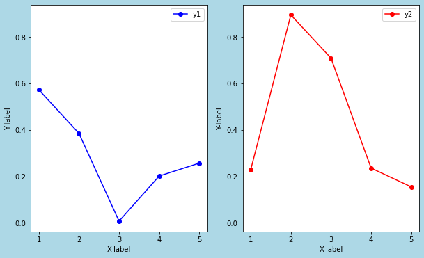
> ax1 = fig.add_subplot(1, 2, 1)
> ax2 = fig.add_subplot(1, 2, 2, sharey=ax1)
The subplots are added to the figure object.
By setting "sharey=ax1", the y-axis of ax2 is synchronized with that of ax1.
> ax1.plot(x, y1, marker='o', color='blue', label='y1')
> ax2.plot(x, y2, marker='o', color='red', label='y2')
The line charts are drawn for each subplot.
The following article explains difference between "plt" plot and "ax" plot.
Difference between "plt" plot and "ax" plot
The following article explains how to plot multiple graphs.
sponsored link
How to plot a line chart by using pandas
I show how to plot a line chart by using pandas.
Pandas is a data analysis support library in Python.
Using Pandas methods, you can easily create a graph.
This is the example code.
import matplotlib.pyplot as plt
import numpy as np
import pandas as pd
x = list(range(1,6))
y1 = np.random.rand(5)
y2 = np.random.rand(5)
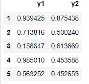
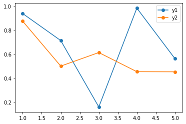
df = pd.DataFrame(data={'y1':y1,'y2':y2}, index=x)
df.plot(marker='o')DataFrame contains data as shown here.
The above code generates the following graph.
> df = pd.DataFrame(data={'y1':y1,'y2':y2}, index=x)
DataFrame is created.
> df.plot(marker='o')
Using "plot" method of DataFrame, a line chart is drawn.
sponsored link