This article shows how to create a scatter plot in matplotlib.
Contents
- How to create a scatter plot
- How to change marker style
- How to plot multiple scatter plots
- How to add value labels to scatter plot
- How to color a scatter plot by value
- How to create a 3D scatter plot
sponsored link
How to create a scatter plot
In the beginning, I show how to create a scatter plot.
Matplotlib provides methods for drawing a scatter plot.
The way to use of "matplotlib.pyplot.scatter" is described in matplotlib documentation.
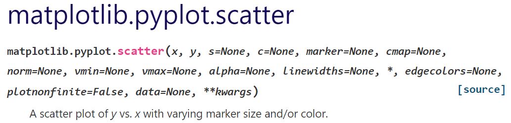
This is the example code to create a scatter plot using "matplotlib.pyplot.scatter".
import matplotlib.pyplot as plt
import numpy as np

x = np.random.rand(100)
y = np.random.rand(100)

plt.scatter(x, y)
plt.show()
The above code generates the following graph.
> plt.scatter(x, y)
The variables "x" and "y" are data lists for scatter plot generation.
How to change marker style
Next, I show how to change marker size, shape, color, and transparency.
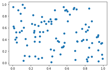
Marker Size
I show how to change marker size.
You can change marker size by using "s=" argument.
This is the example code to change marker size.
import matplotlib.pyplot as plt
import numpy as np

x = np.random.rand(100)
y = np.random.rand(100)

plt.scatter(x, y, s=150)
plt.show()
The above code generates the following graph.
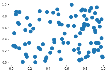
Marker Shape
I show how to change marker shape.
You can change marker size by using "marker=" argument.
This is the example code to change marker shape.
import matplotlib.pyplot as plt
import numpy as np

x = np.random.rand(100)
y = np.random.rand(100)

plt.scatter(x, y, marker='+')
plt.show()
The above code generates the following graph.
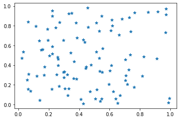
Another example.
marker= ' * '
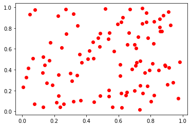
Marker Color
I show how to change marker color.
You can change marker color by using "c=" argument.
This is the example code to change marker color.
import matplotlib.pyplot as plt
import numpy as np

x = np.random.rand(100)
y = np.random.rand(100)

plt.scatter(x, y, c='r')
plt.show()
The above code generates the following graph.
The following article explains how to specify a color of graph elements.
How to Specify a Color[figure, marker, legend]
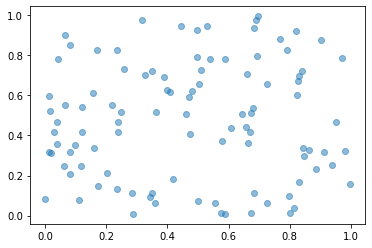
Marker Transparency
I show how to change marker transparency.
You can change marker transparency by using "alpha=" argument.
This is the example code to change marker transparency.
import matplotlib.pyplot as plt
import numpy as np

x = np.random.rand(100)
y = np.random.rand(100)

plt.scatter(x, y, alpha=0.5)
plt.show()
The above code generates the following graph.
sponsored link
How to plot multiple scatter plots
I show how to plot multiple scatter plots.
This is the example code.
import matplotlib.pyplot as plt
import numpy as np

x1 = np.random.rand(100)
y1 = np.random.rand(100)
x2 = np.random.rand(100)
y2 = np.random.rand(100)


plt.scatter(x1, y1, c='r')
plt.scatter(x2, y2, c='b')

plt.show()
The above code generates the following graph.
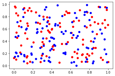
> plt.scatter(x1, y1, c='r')
> plt.scatter(x2, y2, c='b')
Scatter plots are drawn with different colors.
How to add value labels to scatter plot
I show how to add value labels to scatter plot.
You can use the "matplotlib.pyplot.text" functions to add value labels to scatter plot.
This is the example code.
import numpy as np
import matplotlib.pyplot as plt

x = np.random.rand(10)
y = np.random.rand(10)

labels = ['No.'+str(num) for num in range(1,len(x)+1)]

plt.figure(figsize=(6,6))

plt.xlabel('X')
plt.ylabel('Y')

plt.scatter(x, y, s=100)

for i, label in enumerate(labels):
    plt.text(x[i], y[i],label)

plt.show()
The above code generates the following graph.
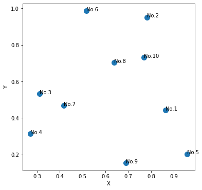
> labels = ['No.'+str(num) for num in range(1,len(x)+1)]
Data labels are created by using list comprehension.
The following article explains how to use comprehension.
> for i, label in enumerate(labels)
> plt.text(x[i], y[i],label)
The "enumerate" function is used to get index and data label.
The "matplotlib.pyplot.text" function is used to add data labels.
The following article explains how to use enumerate funcnion.
sponsored link
How to color a scatter plot by value
I show how to color a scatter plot by value.
This is the example code.
import matplotlib.pyplot as plt
import numpy as np

x = np.random.rand(50)
y = np.random.rand(50)

value = [v_x * v_y for (v_x, v_y) in zip(x, y)]

fig = plt.figure()


cm = plt.cm.get_cmap('jet')

plt.scatter(x, y, c=value, cmap=cm)
plt.colorbar()

plt.show()
The above code generates the following graph.
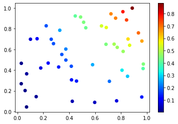
> value = [v_x * v_y for (v_x, v_y) in zip(x, y)]
As an example, calculate the product of data x and y.
The following article explains how to use zip funcnion.
> cm = plt.cm.get_cmap('jet')
> plt.scatter(x, y, c=value, cmap=cm)
The color map "jet" is used.
The argument "cmap=" specifies a colormap.
How to create a 3D scatter plot
I show how to create a 3D scatter plot.
To create a 3D scatter plot, specify "projection='3d' " as the argument of "fig.add_subplot" function.
This is the example code.
import matplotlib.pyplot as plt
import numpy as np


x = np.random.rand(50)
y = np.random.rand(50)
z = np.random.rand(50)

fig = plt.figure()
ax = fig.add_subplot(111, projection='3d')


cm = plt.cm.get_cmap('jet')

mappable = ax.scatter(x, y, z, c=z, cmap=cm)

fig.colorbar(mappable, ax=ax)

plt.show()
The above code generates the following graph.
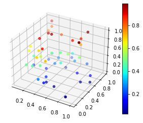
> fig = plt.figure()
> ax = fig.add_subplot(111, projection='3d')
Specify "projection='3d' " as the argument of "fig.add_subplot" function.
> mappable = ax.scatter(x, y, z, c=z, cmap=cm)
To create a 3-dimensional scatter plot, data x, y, and z are specified.
sponsored link