This article shows how to specify a color in matplotlib.
Contents
◆How to specify a color
- Specify a color by name
- Specify a color by RGB tuple
- Specify a color by color code
- Specify a color by grayscale
- Specify transparency
-
◆Detail setting
- How to change figure background color
- How to change edge color of graph
- How to change figure facecolor
- How to change line color
- How to change marker color
- How to change title color
- How to change legend color
A list of color names available in matplotlib is explained in the following article.
sponsored link
How to specify a color
In the beginning, I show how to specify a color.
You can specify a color using the following four ways.
- Specify a color by name
- Specify a color by RGB tuple
- Specify a color by color code
- Specify a color by grayscale
- Specify transparency
Specify a color by name
I show how to specify a color by name.
This is the example code.
import matplotlib.pyplot as plt
import numpy as np
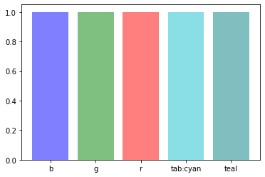
colorlist = ['b', 'g', 'r', 'tab:cyan', 'teal']
x = np.arange(0, len(colorlist))
y = np.repeat(1, len(colorlist))
plt.bar(x, y, color=colorlist, tick_label=colorlist, align="center")
plt.show()The above code generates the following graph.
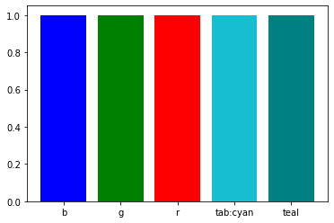
> colorlist = ['b', 'g', 'r', 'tab:cyan', 'teal']
Describe the color names.
> plt.bar(x, y, color=colorlist, tick_label=colorlist, align="center")
Assign colors to bar graphs.
The list of color names is passed to the argument "color=".
Specify a color by RGB tuple
I show how to specify a color by RGB tuple.
This is the example code.
import matplotlib.pyplot as plt
import numpy as np

colorlist = [(0,0,1), (0,1,0), (1,0,0), (0,0,0), (1,1,0)]
x = np.arange(0, len(colorlist))
y = np.repeat(1, len(colorlist))

plt.bar(x, y, color=colorlist, align="center")
plt.show()
The above code generates the following graph.
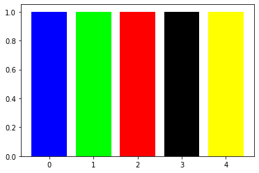
> colorlist = [(0,0,1), (0,1,0), (1,0,0), (0,0,0), (1,1,0)]
Colors are described by RGB tuple.
> plt.bar(x, y, color=colorlist, align="center")
Assign colors to bar graphs.
The list of colors is passed to the argument "color=".
Specify a color by color code
I show how to specify a color by color code.
This is the example code.
import matplotlib.pyplot as plt
import numpy as np

colorlist = ['#00008B', '#228B22', '#B22222', '#FFA500', '#8A2BE2']
x = np.arange(0, len(colorlist))
y = np.repeat(1, len(colorlist))

plt.bar(x, y, color=colorlist, tick_label=colorlist, align="center")
plt.show()
The above code generates the following graph.
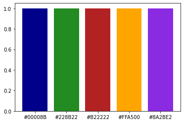
> colorlist = ['#00008B', '#228B22', '#B22222', '#FFA500', '#8A2BE2']
Colors are described by color code.
> plt.bar(x, y, color=colorlist, tick_label=colorlist, align="center")
The list of colors is passed to the argument "color=".
Specify a color by grayscale
I show how to specify a color by grayscale.
This is the example code.
import matplotlib.pyplot as plt
import numpy as np

colorlist = ['0', '0.2', '0.4', '0.6', '0.8', '1.0']
x = np.arange(0, len(colorlist))
y = np.repeat(1, len(colorlist))

plt.bar(x, y, color=colorlist, tick_label=colorlist, align="center")
plt.show()
The above code generates the following graph.
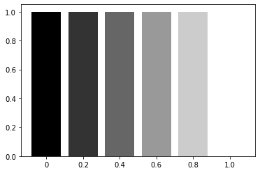
> colorlist = ['0', '0.2', '0.4', '0.6', '0.8', '1.0']
Colors are described by grayscale.
Note that it is written as a string
> plt.bar(x, y, color=colorlist, tick_label=colorlist, align="center")
The list of colors is passed to the argument "color=".
Specify transparency
I show how to specify color transparency.
This is the example code.
import matplotlib.pyplot as plt
import numpy as np

colorlist = ['b', 'g', 'r', 'tab:cyan', 'teal']
x = np.arange(0, len(colorlist))
y = np.repeat(1, len(colorlist))

plt.bar(x, y, color=colorlist, tick_label=colorlist, align="center", alpha=0.5)
plt.show()
The above code generates the following graph.
> plt.bar(x, y, color=colorlist, tick_label=colorlist, align="center", alpha=0.5)
The color transparency can be changed by specifying the argument "alpha=".
sponsored link
How to change figure background color
I show how to change figure background color.
This is the example code.
import matplotlib.pyplot as plt
import numpy as np
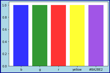
colorlist = ['b', 'g', 'r', 'yellow', '#8A2BE2']
x = np.arange(0, len(colorlist))
y = np.repeat(1, len(colorlist))
fig = plt.figure(figsize = (6,4), facecolor='lightblue')
plt.bar(x, y, color=colorlist, tick_label=colorlist, align="center", alpha=0.8)
plt.show()The above code generates the following graph.
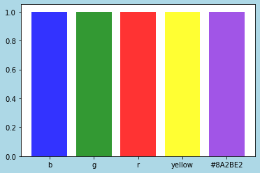
fig = plt.figure(figsize = (6,4), facecolor='lightblue')
A figure object is generated.
The background color can be changed by specifying the argument "facecolor=".
How to change edge color of graph
I show how to change edge color of graph.
This is the example code.
import matplotlib.pyplot as plt
import numpy as np
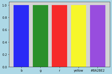
colorlist = ['b', 'g', 'r', 'yellow', '#8A2BE2']
x = np.arange(0, len(colorlist))
y = np.repeat(1, len(colorlist))
fig = plt.figure(figsize = (6,4), facecolor='lightblue', edgecolor='darkblue', linewidth=5)
plt.bar(x, y, color=colorlist, tick_label=colorlist, align="center", alpha=0.8)
plt.show()The above code generates the following graph.
> fig = plt.figure(figsize = (6,4), facecolor='lightblue', edgecolor='darkblue', linewidth=5)
A figure object is generated.
The line width can be changed by specifying the argument "linewidth=".
The edge color can be changed by specifying the argument "edgecolor=".
How to change figure facecolor
I show how to change figure facecolor.
This is the example code.
import matplotlib.pyplot as plt
import numpy as np

colorlist = ['b', 'g', 'r', 'yellow', '#8A2BE2']
x = np.arange(0, len(colorlist))
y = np.repeat(1, len(colorlist))

fig = plt.figure(figsize = (6,4), facecolor='lightblue')
plt.rcParams['axes.facecolor'] = 'lightgray'

plt.bar(x, y, color=colorlist, tick_label=colorlist, align='center', alpha=0.8)

plt.show()
The above code generates the following graph.
> plt.rcParams['axes.facecolor'] = 'lightgray'
The rcParams can be used to make detailed setting.
To change the facecolor, specify the argument 'axes.facecolor'.
sponsored link
How to change line color
I show how to change line color.
This is the example code.
import matplotlib.pyplot as plt
import numpy as np

x = np.linspace(0, 10, 100)
y = np.sin(x)

fig = plt.figure(figsize = (6,4), facecolor='lightblue', edgecolor='darkblue', linewidth=3)
plt.rcParams['axes.facecolor'] = 'lightgray'

plt.xlabel('X')
plt.ylabel('Y')

plt.plot(x, y, linestyle='solid', marker='o', label='sin', color='darkblue')

plt.legend()

plt.show()
The above code generates the following graph.
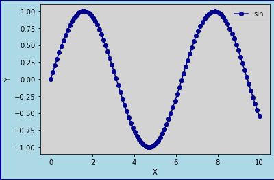
> plt.plot(x, y, linestyle='solid', marker='o', label='sin', color='darkblue')
The line color can be changed by specifying the argument "color=".
How to change marker color
I show how to change marker color.
This is the example code.
import matplotlib.pyplot as plt
import numpy as np

x = np.linspace(0, 10, 100)
y = np.sin(x)

fig = plt.figure(figsize = (6,4), facecolor='lightblue', edgecolor='darkblue', linewidth=3)
plt.rcParams['axes.facecolor'] = 'lightgray'

plt.xlabel('X')
plt.ylabel('Y')

plt.plot(x, y, linestyle='solid', marker='o', label='sin', color='darkblue',
        markeredgecolor='k',markerfacecolor='g')

plt.legend()

plt.show()
The above code generates the following graph.
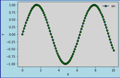
> plt.plot(x, y, linestyle='solid', marker='o', label='sin', color='darkblue',
> markeredgecolor='k',markerfacecolor='g')
The marker color can be changed by specifying the argument "markerfacecolor=".
sponsored link
How to change title color
I show how to change title color.
This is the example code.
import matplotlib.pyplot as plt
import numpy as np

x = np.linspace(0, 10, 100)
y = np.sin(x)

fig = plt.figure(figsize = (6,4), facecolor='lightblue', edgecolor='darkblue', linewidth=3)
fig.suptitle("Title", size=16, color='r')
plt.rcParams['axes.facecolor'] = 'lightgray'

plt.xlabel('X')
plt.ylabel('Y')

plt.plot(x, y, linestyle='solid', marker='o', label='sin', color='darkblue',
        markeredgecolor='k',markerfacecolor='g')

plt.legend()

plt.show()
The above code generates the following graph.
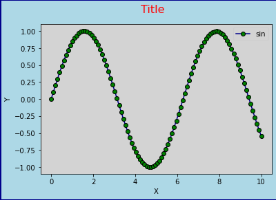
> fig.suptitle("Title", size=16, color='r')
The title is added to the figure object.
The title color can be changed by specifying the argument "color=".
How to change legend color
I show how to change legend color.
This is the example code.
import matplotlib.pyplot as plt
import numpy as np

x = np.linspace(0, 10, 100)
y = np.sin(x)

fig = plt.figure(figsize = (6,4), facecolor='lightblue', edgecolor='darkblue', linewidth=3)
fig.suptitle("Title", size=16, color='r')
plt.rcParams['axes.facecolor'] = 'lightgray'

plt.xlabel('X')
plt.ylabel('Y')

plt.plot(x, y, linestyle='solid', marker='o', label='sin', color='darkblue',
        markeredgecolor='k',markerfacecolor='g')

plt.legend(facecolor='w', edgecolor='k', labelcolor='r')

plt.show()
The above code generates the following graph.
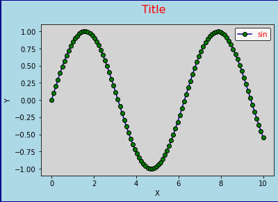
> plt.legend(facecolor='w', edgecolor='k', labelcolor='r')
You can specify facecolor, edgecolor, and labelcolor.
sponsored link