This article shows how to plot a gradient color line in matplotlib.
Contents
◆About colormap
◆How to plot a gradient graph
- Gradient color for scatter plot
- Gradient color for line graph
- Gradient color for bar plot
- [Supplement]Gradient color without using colormap
The following article describes how to change the color of a graph element.
sponsored link
About colormap
To plot a gradient color line, it is useful to use a colormap.
I show the colormap.
The following five types of color maps are available.
- Sequential
- Diverging
- Cyclic
- Qualitative
- Miscellaneous
I show each of these colormaps.
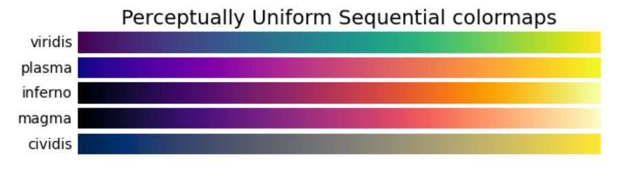
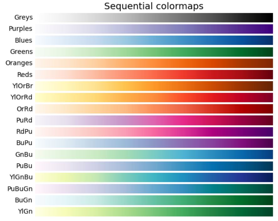
Sequential
"Sequential" is a color map that continuously changes hue and saturation of colors.
It is suitable for graphs where you want to express order.
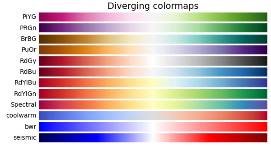
Diverging
"Diverging" is a color map that changes hue in the center.
It is suitable when the median has important data.
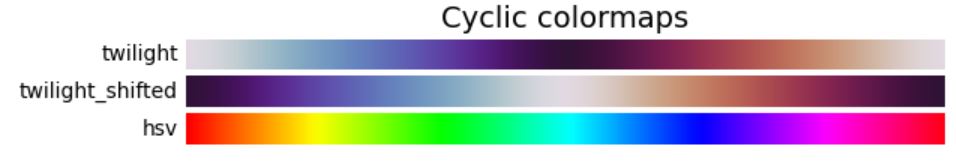
Cyclic
"Cyclic" is a colormap that matches the brightness of the data at the edges.
For example, it is suitable for representing data such as wind direction and angle.
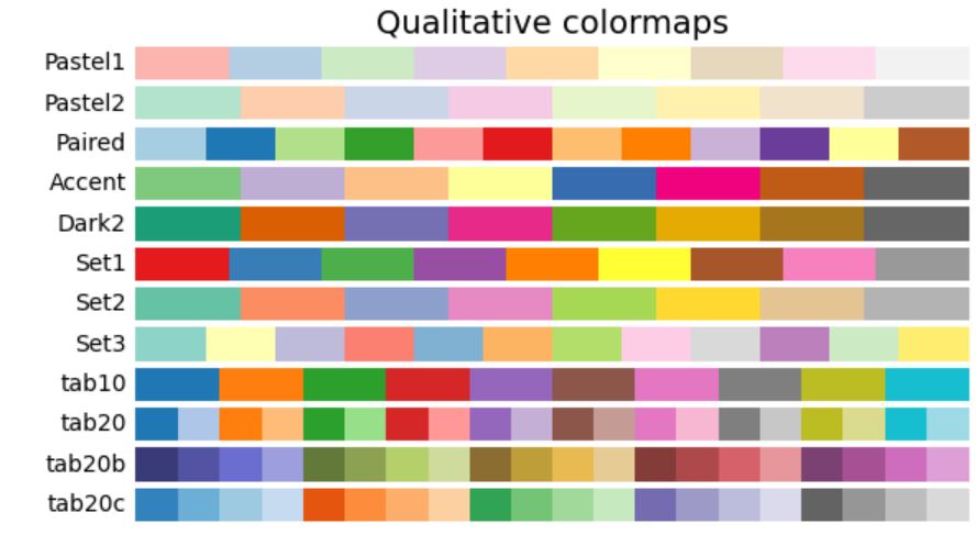
Qualitative
"Qualotative" is a color map with disparate hues.
For example, it is suitable for pie chart.
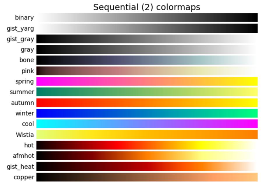
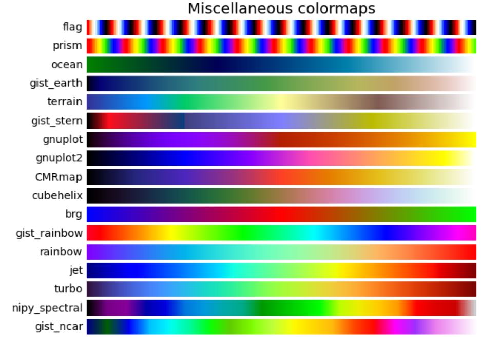
Miscellaneous
Other colormaps.
sponsored link
Gradient color for scatter plot
I show how to apply a colormap to a scatter plot.
Matplotlib provides methods for drawing a scatter plot.
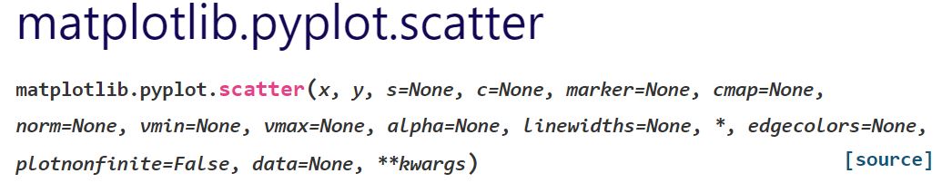
The way to use of "matplotlib.pyplot.scatter" is described in matplotlib documentation.
A colormap can be applied by specifying the argument "cmap=".
This is the example code.
import matplotlib.pyplot as plt
import matplotlib.cm as cm
import numpy as np

x = np.random.rand(100)
y = np.random.rand(100)
value = np.random.rand(100)

fig = plt.figure(figsize = (6,4), facecolor='lightblue')
plt.xlabel('X')
plt.ylabel('Y')

plt.scatter(x, y, s=50, c=value, cmap='Blues')

plt.colorbar(ticks=np.arange(0, 1, 0.1))

plt.show()
The above code generates the following graph.
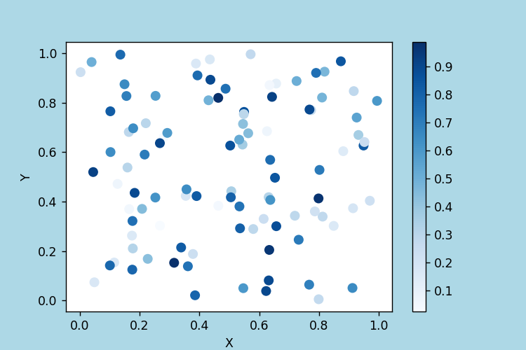
plt.scatter(x, y, s=50, c=value, cmap='Blues')
The colormap "Blues" is passed to argument "cmap=".
plt.colorbar(ticks=np.arange(0, 1, 0.1))
Color bar is displayed.
Gradient color for line graph
I show how to apply a colormap to a line graph.
Matplotlib provides methods for drawing a line graph.
The way to use of "matplotlib.pyplot.plot" is described in matplotlib documentation.
Unlike scatter plots, color maps cannot be specified as arguments.
To make a line graph color gradient, specify one color at a time as the argument.
This is the example code.
import matplotlib.pyplot as plt
import matplotlib.cm as cm
import numpy as np
num = 10
x = np.linspace(0, np.pi * 2, 100)
fig = plt.figure(figsize = (6,4), facecolor='lightblue')
plt.xlabel('X')
plt.ylabel('Y')
for i in range(num):
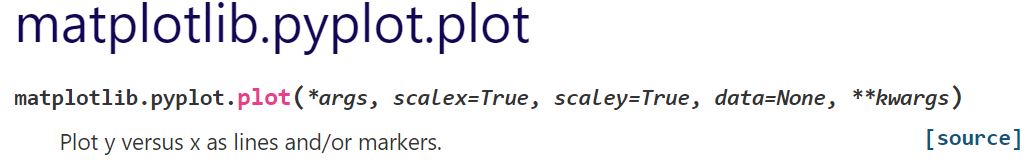
y = np.sin(x) + i
plt.plot(x, y, linestyle='solid', label=str(i), color=cm.Blues(i/num))
plt.legend(loc=(1,0.29))
plt.show()The above code generates the following graph.
> plt.plot(x, y, linestyle='solid', label=str(i), color=cm.Blues(i/num))
The color of colormap "Blues" is passed to the argument "color=" one by one.
> plt.legend(loc=(1,0.29))
Legend is added.
The following article explains how to add legend.
sponsored link
Gradient color for bar plot
I show how to apply a colormap to a bar plot.
Matplotlib provides methods for drawing a bar plot.
The way to use of "matplotlib.pyplot.bar" is described in matplotlib documentation.
Unlike scatter plots, color maps cannot be specified as arguments.
To make a bar color gradient, specify one color at a time as the argument.
This is the example code.
import matplotlib.pyplot as plt
import matplotlib.cm as cm
import numpy as np

num = 10

fig = plt.figure(figsize = (6,4), facecolor='lightblue')
plt.xlabel('X')
plt.ylabel('Y')
plt.xticks(np.arange(0, num, 1))

for x in range(num):
    y = 1
    plt.bar(x, y, color=cm.Blues(x/num), align='center')

plt.show()
The above code generates the following graph.
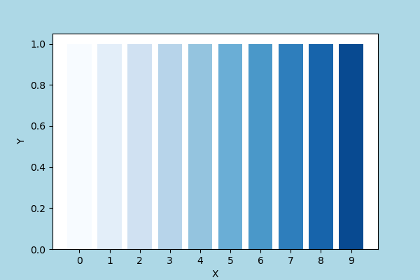
> plt.bar(x, y, color=cm.Blues(x/num), align='center')
The color of colormap "Blues" is passed to the argument "color=" one by one.
[Supplement]Gradient color without using colormap
I show how to use gradient color without using colormap.
By passing an RGB tuple as the argument "color=", you can make the graph color gradient.
This is the example code.
import matplotlib.pyplot as plt
import numpy as np

num = 10

fig = plt.figure(figsize = (6,4), facecolor='lightblue')
plt.xlabel('X')
plt.ylabel('Y')
plt.xticks(np.arange(0, num, 1))

for x in range(num):
    y = 1
    plt.bar(x, y, align='center', color=(0,0,x/num))

plt.show()
The above code generates the following graph.
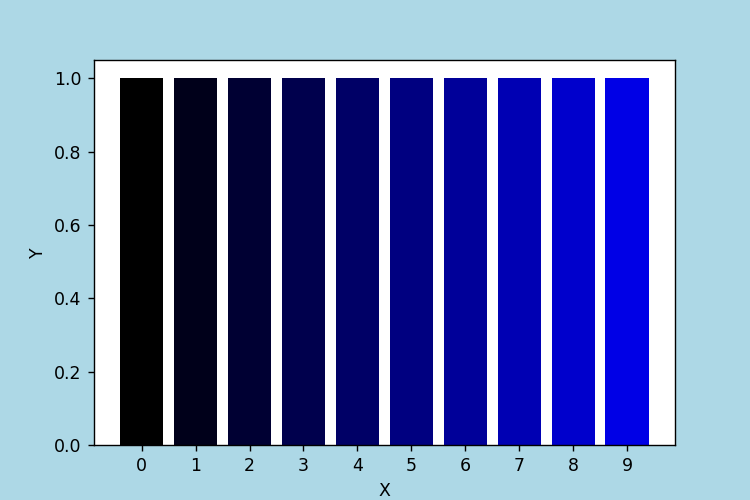
> plt.bar(x, y, align='center', color=(0,0,x/num))
The value of Blue in the RGB tuple is changed.
sponsored link