There are the two graph drawing methods in matplotlib.
This article shows difference between "plt" plot and "ax" plot.
Contents
- Difference between "plt" plot and "ax" plot.
- How to draw multiple graphs ["ax" plot]
- [Supplement]Example of graph drawing
sponsored link
Difference between "plt" plot and "ax" plot.
I show difference between "plt" plot and "ax" plot.
【 pyplot.~~~ 】
The "pyplot module" is often imported in the form "import matplotlib.pyplot as plt", so it is often written as "plt.~~~" in the code.
"matplotlib" is made to imitate MATLAB's method of generating plots, which is called "pyplot".
The way using "pyplot" can easily create graphs, but does not allow for fine tuning, so it is suitable when you want to check results quickly.
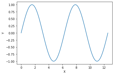
This is the example code to create a graph by using "plt.plot()".
import numpy as np
import matplotlib.pyplot as plt

x = np.linspace(0, np.pi * 4, 100)
y = np.sin(x)

plt.plot(x, y)
plt.show()
The above code generates the following graph.
【 ax.~~~ 】
This is an object-oriented method.
First, create an instance of the "Figure" object.
A single "Figure" can contain multiple subplots, called "Axes".

"Figure" and "Axes" objects are created by using "plot.subplots( )" command.
Draw graphs for individual "Axes" objects using "ax.plot( )".
This is the example code to create a graph by using "ax.plot( )".
import numpy as np
import matplotlib.pyplot as plt

x = np.linspace(0, np.pi * 4, 100)
y = np.sin(x)

fig, ax = plt.subplots()

ax.plot(x, y)
plt.show()
The above code generates the following graph.
Basically, if "set_" is added to a function of "plt.plot( )", it becomes a function name that can be used in "ax.plot( )".
[example]
plt.xlabel('X')
ax.set_xlabel('X')
[Supplement] Functions of "plt" plot and "ax" plot
As supplement, I show difference between "plt" plot and "ax" plot functions.
Create the following graphs using "plt" plot and "ax" plot.
【 pyplot.~~~ 】
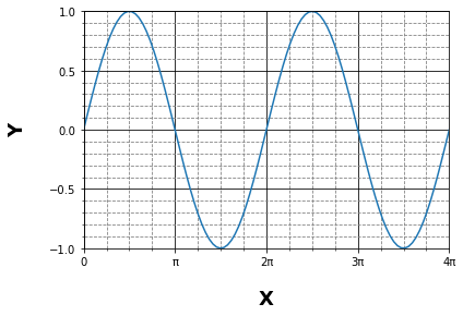
This is the example code to create a graph by using "pyplot.~~~".
import numpy as np
import matplotlib.pyplot as plt

x = np.linspace(0, np.pi * 4, 100)
y = np.sin(x)

plt.plot(x, y)

plt.xlabel('X', labelpad = 20, weight ='bold', size = 18, color ='black')
plt.ylabel('Y', labelpad = 20, weight ='bold', size = 18, color ='black')

plt.xlim(0, np.pi * 4)
plt.ylim(-1, 1)


plt.xticks(np.arange(0, np.pi*5, np.pi),['0', 'π', '2π', '3π', '4π'])
plt.yticks([-1, -0.5, 0, 0.5, 1])

plt.minorticks_on()

plt.grid(which = 'major', color='black' )
plt.grid(which = 'minor', color='gray', linestyle='--')

plt.show()
【 ax.~~~ 】
This is the example code to create a graph by using "ax.~~~".
import numpy as np
import matplotlib.pyplot as plt

x = np.linspace(0, np.pi * 4, 100)
y = np.sin(x)

fig, ax = plt.subplots(figsize = (8,6))

ax.plot(x, y)

ax.set_xlabel('X', labelpad = 20, weight ='bold', size = 18, color ='black')
ax.set_ylabel('Y', labelpad = 20, weight ='bold', size = 18, color ='black')

ax.set_xlim(0, np.pi * 4)
ax.set_ylim(-1, 1)

ax.set_xticks(np.arange(0, np.pi*5, np.pi))
ax.set_xticklabels(['0', 'π', '2π', '3π', '4π'])
ax.set_yticks([-1, -0.5, 0, 0.5, 1])

ax.minorticks_on()

ax.grid(which = 'major', color='black' )
ax.grid(which = 'minor', color='gray', linestyle='--')

plt.show()
Basically, there is "set_" difference between the function names of the two methods.
> ax.set_xticks(np.arange(0, np.pi*5, np.pi))
> ax.set_xticklabels(['0', 'π', '2π', '3π', '4π'])
The x-axis scale is replaced from a numerical value to a string.
For this code, the function name is different between the two methods.
sponsored link
How to draw multiple graphs ["ax" plot]
I show how to draw multiple graphs.
By using "ax" plot, multiple "Axis" can be drawn in one "Figure" area.
This is the example code.
Four different graphs are drawn in one "Figure" area.
import numpy as np
import matplotlib.pyplot as plt


x = np.linspace(0, 10, 1000)

y1 = np.sin(x)
y2 = np.cos(x)
y3 = -np.sin(x)
y4 = np.sin(x)**2


c1,c2,c3,c4 = 'blue', 'green', 'red', 'black'
l1,l2,l3,l4 = 'sin', 'cos', '-sin', 'sin**2'

xl1, xl2, xl3, xl4 = 'x', 'x', 'x', 'x'
yl1, yl2, yl3, yl4 = 'sin', 'cos', '-sin', 'sin**2'


# create fig object
fig = plt.figure(figsize = (10,6), facecolor='lightblue')


# create subplot
ax1 = fig.add_subplot(2, 2, 1)
ax2 = fig.add_subplot(2, 2, 2)
ax3 = fig.add_subplot(2, 2, 3)
ax4 = fig.add_subplot(2, 2, 4)


# pass data to subplot
ax1.plot(x, y1, color=c1, label=l1)
ax2.plot(x, y2, color=c2, label=l2)
ax3.plot(x, y3, color=c3, label=l3)
ax4.plot(x, y4, color=c4, label=l4)


# create xlabel
ax1.set_xlabel(xl1)
ax2.set_xlabel(xl2)
ax3.set_xlabel(xl3)
ax4.set_xlabel(xl4)


# create ylabel
ax1.set_ylabel(yl1)
ax2.set_ylabel(yl2)
ax3.set_ylabel(yl3)
ax4.set_ylabel(yl4)


# create legend
ax1.legend(loc = 'upper right')
ax2.legend(loc = 'upper right')
ax3.legend(loc = 'upper right')
ax4.legend(loc = 'upper right')


plt.show()
The above code generates the following graph.
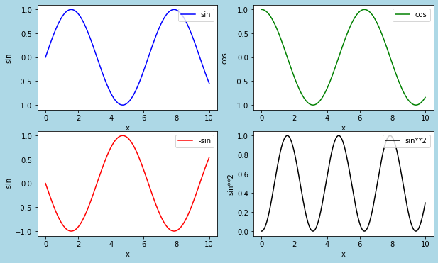
> fig = plt.figure(figsize = (10,6), facecolor='lightblue')
The graph drawing area is created as a "fig" object.
> ax1 = fig.add_subplot(2, 2, 1)
> ax2 = fig.add_subplot(2, 2, 2)
> ax3 = fig.add_subplot(2, 2, 3)
> ax4 = fig.add_subplot(2, 2, 4)
Four "subplot" are added in "fig" object.
> ax1.plot(x, y1, color=c1, label=l1)
> ax2.plot(x, y2, color=c2, label=l2)
> ax3.plot(x, y3, color=c3, label=l3)
> ax1.plot(x, y4, color=c4, label=l4)
A graph is drawn for each "Axis".
sponsored link
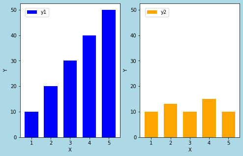
[Supplement]Example of graph drawing
As a supplement, I show some other examples of drawing graphs by using "ax" plot.
This is the example code for drawing two bar graphs side by side.
import numpy as np
import matplotlib.pyplot as plt


x = np.array([1, 2, 3, 4, 5])

y1 = np.array([10, 20, 30, 40, 50])
y2 = np.array([10, 13, 10, 15, 10])


fig = plt.figure(figsize = (8,5), facecolor='lightblue')

ax1 = fig.add_subplot(1, 2, 1)
ax2 = fig.add_subplot(1, 2, 2)

ax1.bar(x, y1, label='y1', width=0.7, align='center', color='blue')
ax2.bar(x, y2, label='y2', width=0.7, align='center', color='orange')

ax1.set_xlabel('X')
ax1.set_ylabel('Y')

ax2.set_xlabel('X')
ax2.set_ylabel('Y')

ax1.legend(loc=(0.05, 0.9))
ax2.legend(loc=(0.05, 0.9))

plt.show()
The above code generates the following graph.
The Y-axis scales of these bars are different.
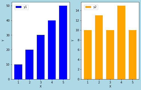
To make it easier to see, let's make the Y-axis scales the same for the two graphs.
import numpy as np
import matplotlib.pyplot as plt


x = np.array([1, 2, 3, 4, 5])

y1 = np.array([10, 20, 30, 40, 50])
y2 = np.array([10, 13, 10, 15, 10])


fig = plt.figure(figsize = (8,5), facecolor='lightblue')

ax1 = fig.add_subplot(1, 2, 1)
ax2 = fig.add_subplot(1, 2, 2, sharey=ax1)

ax1.bar(x, y1, label='y1', width=0.7, align='center', color='blue')
ax2.bar(x, y2, label='y2', width=0.7, align='center', color='orange')

ax1.set_xlabel('X')
ax1.set_ylabel('Y')

ax2.set_xlabel('X')
ax2.set_ylabel('Y')

ax1.legend(loc=(0.05, 0.9))
ax2.legend(loc=(0.05, 0.9))

plt.show()
The above code generates the following graph.
Thus, creating graphs in an object-oriented method makes it easier to compare two graphs.
> ax1 = fig.add_subplot(1, 2, 1)
> ax2 = fig.add_subplot(1, 2, 2, sharey=ax1)
By setting "sharey = ax1", the Y-axis of ax2 is shared with ax1.
sponsored link