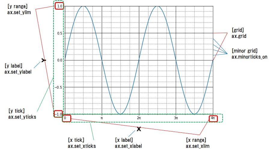
This article shows how to set axes elements in matplotlib.
Contents
- [Supplement] Difference between "plt" plot and "ax" plot
- How to Add Axis Labels
- How to Set Axis Range
- How to Set Axis Ticks
- How to Add Grid Lines
This article shows how to set axes elements in the figure below.
sponsored link
[Supplement] Difference between "plt" plot and "ax" plot
In the beginning, I show how to plot a graph in matplotlib.
There are the two graph drawing methods in matplotlib.
【 pyplot.~~~ 】
The "pyplot module" is often imported in the form "import matplotlib.pyplot as plt", so it is often written as "plt.~~~" in the code.
"matplotlib" is made to imitate MATLAB's method of generating plots, which is called "pyplot".
The way using "pyplot" can easily create graphs, but does not allow for fine tuning, so it is suitable when you want to check results quickly.
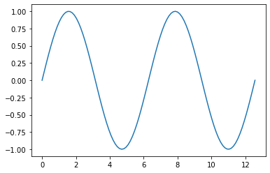
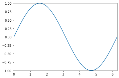
This is the example code to create a graph by using "plt.plot()".
import numpy as np
import matplotlib.pyplot as plt

x = np.linspace(0, np.pi * 4, 100)
y = np.sin(x)

plt.plot(x, y)
plt.show()
The above code generates the following graph.
【 ax.~~~ 】
This is an object-oriented method.
First, create an instance of the "Figure" object.
A single "Figure" can contain multiple subplots, called "Axes".

"Figure" and "Axes" objects are created by using "plot.subplots( )" command.
Draw graphs for individual "Axes" objects using "ax.plot( )".
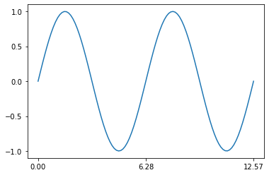
This is the example code to create a graph by using "ax.plot( )".
import numpy as np
import matplotlib.pyplot as plt

x = np.linspace(0, np.pi * 4, 100)
y = np.sin(x)

fig, ax = plt.subplots()

ax.plot(x, y)
plt.show()
The above code generates the following graph.
Basically, if "set_" is added to a function of "plt.plot( )", it becomes a function name that can be used in "ax.plot( )".
【Example】
plt.xlabel('X')
ax.set_xlabel('X')
Please also see this article.
Difference between "plt" plot and "ax" plot
From here, I show how to set axis elements.
Two example codes, "pyplot.~~~" and "ax.~~~", will be described.
sponsored link
How to Add Axis Labels
I show how to add axis labels.
【 pyplot.~~~ 】
You can use the "xlabel( )" and "ylabel( )" functions to set a axis label for the x- and y-axis.
import numpy as np
import matplotlib.pyplot as plt
x = np.linspace(0, np.pi * 4, 100)
y = np.sin(x)
plt.plot(x, y)
plt.xlabel('X')
plt.ylabel('Y')
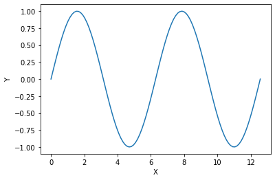
plt.show()【 ax.~~~ 】
You can use the "set_xlabel( )" and "set_ylabel( )" functions to set a axis label for the x- and y-axis.
import numpy as np
import matplotlib.pyplot as plt

x = np.linspace(0, np.pi * 4, 100)
y = np.sin(x)

fig, ax = plt.subplots()

ax.plot(x, y)

ax.set_xlabel('X')
ax.set_ylabel('Y')

plt.show()
The above code generates the following graph.
[Supplement] Adjust Axis Labels
I show how to change the size and color of labels.
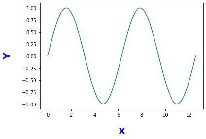
【 ax.~~~ 】
This is an example code.
import numpy as np
import matplotlib.pyplot as plt

x = np.linspace(0, np.pi * 4, 100)
y = np.sin(x)

fig, ax = plt.subplots()

ax.plot(x, y)

ax.set_xlabel('X', labelpad = 20, weight ='bold', size = 18, color ='b')
ax.set_ylabel('Y', labelpad = 20, weight ='bold', size = 18, color ='b')

plt.show()
The above code generates the following graph.
How to Set Axis Range
I show how to set axis range.
【 pyplot.~~~ 】
You can use the "xlim( )" and "ylim( )" functions to set range for the x- and y-axis.
import numpy as np
import matplotlib.pyplot as plt

x = np.linspace(0, np.pi * 4, 100)
y = np.sin(x)

plt.plot(x, y)

plt.xlim(0, np.pi * 2)
plt.ylim(-1, 1)

plt.show()
【 ax.~~~ 】
You can use the "set_xlim( )" and "set_ylim( )" functions to set range for the x- and y-axis.
import numpy as np
import matplotlib.pyplot as plt

x = np.linspace(0, np.pi * 4, 100)
y = np.sin(x)

fig, ax = plt.subplots()

ax.plot(x, y)

ax.set_xlim(0, np.pi * 2)
ax.set_ylim(-1, 1)

plt.show()
The above code generates the following graph.
The range of the axis is changed to one period from 0 to 2π.
sponsored link
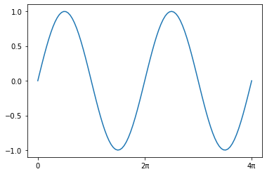
How to Set Axis Ticks
I show how to set axis ticks.
【 pyplot.~~~ 】
You can use the "xticks( )" and "yticks( )" functions to set ticks for the x- and y-axis.
import numpy as np
import matplotlib.pyplot as plt

x = np.linspace(0, np.pi * 4, 100)
y = np.sin(x)

plt.plot(x, y)

plt.xticks([0, np.pi, np.pi*2, np.pi*3, np.pi*4])
plt.yticks([-1, -0.5, 0, 0.5, 1])

plt.show()
【 ax.~~~ 】
You can use the "set_xticks( )" and "set_yticks( )" functions to set ticks for the x- and y-axis.
import numpy as np
import matplotlib.pyplot as plt

x = np.linspace(0, np.pi * 4, 100)
y = np.sin(x)

fig, ax = plt.subplots()

ax.plot(x, y)

ax.set_xticks([0, np.pi, np.pi*2, np.pi*3, np.pi*4])
ax.set_yticks([-1, -0.5, 0, 0.5, 1])

plt.show()
The above code generates the following graph.

The step size on the x-axis is π and the step size on the y-axis is 0.5.
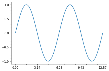
How to Specify the Step Size of Axis Ticks
I show how to specify the step size using numpy.
You can use the "np.arange( )" function to create a list of equally spaced numbers.
【 pyplot.~~~ 】
import numpy as np
import matplotlib.pyplot as plt

x = np.linspace(0, np.pi * 4, 100)
y = np.sin(x)

plt.plot(x, y)

plt.xticks(np.arange(0, np.pi*5, np.pi*2))
plt.yticks([-1, -0.5, 0, 0.5, 1])

plt.show()
【 ax.~~~ 】
import numpy as np
import matplotlib.pyplot as plt

x = np.linspace(0, np.pi * 4, 100)
y = np.sin(x)

fig, ax = plt.subplots()

ax.plot(x, y)

ax.set_xticks(np.arange(0, np.pi*5, np.pi*2))
ax.set_yticks([-1, -0.5, 0, 0.5, 1])

plt.show()
The above code generates the following graph.
The x-axis is from 0 to 4π in 2π increments.
How to Specify a String for the Axis Ticks
I show how to specify a string for the axis ticks.
【 pyplot.~~~ 】
You can use the "xticks( [number, number, ... ], [string, string, ... ] )" function to specify a string for ticks for the axis ticks.
import numpy as np
import matplotlib.pyplot as plt

x = np.linspace(0, np.pi * 4, 100)
y = np.sin(x)

plt.plot(x, y)

plt.xticks([0, np.pi*2, np.pi*4], ['0', '2π', '4π'])
plt.yticks([-1, -0.5, 0, 0.5, 1])

plt.show()
【 ax.~~~ 】
The method of specification differs from that of "pyplot.~~~".
Specify the numerical value and string of the axis ticks separately as shown below.
ax.set_xticks( [number, number, ... ] )
ax.set_xticklabels( [string, string, ... ] )
import numpy as np
import matplotlib.pyplot as plt

x = np.linspace(0, np.pi * 4, 100)
y = np.sin(x)

fig, ax = plt.subplots()

ax.plot(x, y)

ax.set_xticks([0, np.pi*2, np.pi*4])
ax.set_xticklabels(['0', '2π', '4π'])
ax.set_yticks([-1, -0.5, 0, 0.5, 1])

plt.show()
The above code generates the following graph.
sponsored link
How to Set Minor Ticks
I show how to set a minor ticks.
【 pyplot.~~~ 】
You can use the "minorticks_on( )" function to set a minor ticks.
import numpy as np
import matplotlib.pyplot as plt

x = np.linspace(0, np.pi * 4, 100)
y = np.sin(x)

plt.plot(x, y)

plt.xticks(np.arange(0, np.pi*5, np.pi))
plt.yticks([-1, -0.5, 0, 0.5, 1])

plt.minorticks_on()

plt.show()
【 ax.~~~ 】
You can use the "minorticks_on( )" function to set a minor ticks.
import numpy as np
import matplotlib.pyplot as plt

x = np.linspace(0, np.pi * 4, 100)
y = np.sin(x)

fig, ax = plt.subplots()

ax.plot(x, y)

ax.set_xticks(np.arange(0, np.pi*5, np.pi))
ax.set_yticks([-1, -0.5, 0, 0.5, 1])

ax.minorticks_on()

plt.show()
The above code generates the following graph.
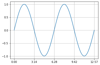
How to Add Grid Lines
I show how to add grid lines.
【 pyplot.~~~ 】
You can use the "grid( )" function to add grid lines.
import numpy as np
import matplotlib.pyplot as plt

x = np.linspace(0, np.pi * 4, 100)
y = np.sin(x)

plt.plot(x, y)

plt.xticks(np.arange(0, np.pi*5, np.pi))
plt.yticks([-1, -0.5, 0, 0.5, 1])

plt.grid()

plt.show()
【 ax.~~~ 】
You can use the "grid( )" function to add grid lines.
import numpy as np
import matplotlib.pyplot as plt

x = np.linspace(0, np.pi * 4, 100)
y = np.sin(x)

fig, ax = plt.subplots()

ax.plot(x, y)

ax.set_xticks(np.arange(0, np.pi*5, np.pi))
ax.set_yticks([-1, -0.5, 0, 0.5, 1])

ax.grid()

plt.show()
The above code generates the following graph.
Example of setting grid lines
I show example of setting grid lines.
【 ax.~~~ 】
This is an example code.
import numpy as np
import matplotlib.pyplot as plt

x = np.linspace(0, np.pi * 4, 100)
y = np.sin(x)

fig, ax = plt.subplots()

ax.plot(x, y)

ax.set_xticks(np.arange(0, np.pi*5, np.pi))
ax.set_yticks([-1, -0.5, 0, 0.5, 1])

ax.minorticks_on()

ax.grid(which = 'major', color='black' )
ax.grid(which = 'minor', color='gray', linestyle='--')

plt.show()
The above code generates the following graph.
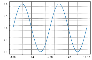
> ax.minorticks_on()
The minor ticks is displayed.
> ax.grid(which = 'major', color='black' )
> ax.grid(which = 'minor', color='gray', linestyle='--')
Adjust the main and minor ticks.
sponsored link