This article shows how to plot a histogram in matplotlib.
Contents
- How to Plot a Histogram
- How to Change Bin Size in the Histogram
- How to Change X Range in the Histogram
- How to Normalize the Histogram
- How to Add a Border around Histogram Bars
- How to Plot Multiple Histograms
sponsored link
How to Plot a Histogram
In the beginning, I show how to plot a histgram.
Matplotlib provides methods for drawing histograms.
The way to use of "matplotlib.pyplot.hist" is described in matplotlib documentation.
matplotlib documentation
This is the example code to plot a histogram using "matplotlib.pyplot.hist".
import numpy as np
import matplotlib.pyplot as plt

# Generate random numbers following a normal distribution
x = np.random.normal(0, 10, 1000)

fig = plt.figure(figsize = (5,5), facecolor='lightblue')

plt.xlabel('X')
plt.ylabel('Y')

plt.hist(x)

plt.show()
The above code generates the following graph.
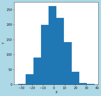
> plt.hist(x)
The variable "x" is a list of data for histogram generation.
How to Change Bin Size in the Histogram
Next, I show how to change bin size in the histogram.
You can change bin size in the histogram by specifying "bins=" as an argument.
This is the example code.
import numpy as np
import matplotlib.pyplot as plt

# Generate random numbers following a normal distribution
x = np.random.normal(0, 10, 1000)

fig = plt.figure(figsize = (5,5), facecolor='lightblue')

plt.xlabel('X')
plt.ylabel('Y')

plt.hist(x,  bins=20)

plt.show()
The above code generates the following graph.
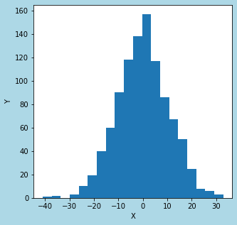
plt.hist(x, bins=20)
The argument "bins" is used to specify bin size in the histogram.
sponsored link
How to Change X Range in the Histogram
I show how to change x range in the histogram.
You can change x range by specifying "range=" as an argument.
The width per bin can be calculated from the bin size and the range
Bin width = Range / Bin size
This is the example code.
import numpy as np
import matplotlib.pyplot as plt

# Generate random numbers following a normal distribution
x = np.random.normal(0, 10, 1000)

fig = plt.figure(figsize = (5,5), facecolor='lightblue')

plt.hist(x, bins=20, range=(-50, 50))

plt.xlabel('X')
plt.ylabel('Y')

plt.show()
The above code generates the following graph.
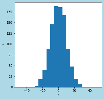
> plt.hist(x, bins=20, range=(-50, 50))
The argument "range" is used to specify x range in the histogram.
The range is 100 and the bin size is 20, so the width per bin is 5.
How to Normalize the Histogram
I show how to normalize the histogram.
You can normalize the histogram (set the area to 1) by specifying "density = True" as an argument.
This is the example code.
import numpy as np
import matplotlib.pyplot as plt

# Generate random numbers following a normal distribution
x = np.random.normal(0, 10, 1000)

fig = plt.figure(figsize = (5,5), facecolor='lightblue')

plt.xlabel('X')
plt.ylabel('Y')

plt.hist(x,  bins=20, range=(-50, 50), density=True)

plt.show()
The above code generates the following graph.
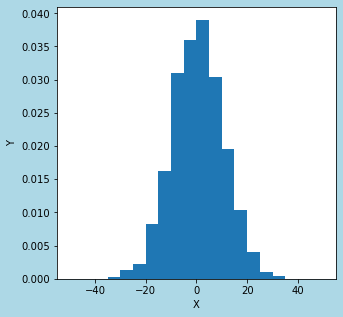
> plt.hist(x, bins=20, range=(-50, 50), density=True)
The argument "density" is used to normalize the histogram.
sponsored link
How to Add a Border around Histogram Bars
I show how to add a border around histogram bars.
You can add a border by specifying "ec = " as an argument.
"ec" stands for "edge color".
This is the example code.
import numpy as np
import matplotlib.pyplot as plt

# Generate random numbers following a normal distribution
x = np.random.normal(0, 10, 1000)

fig = plt.figure(figsize = (5,5), facecolor='lightblue')

plt.xlabel('X')
plt.ylabel('Y')

plt.hist(x,  bins=20, range=(-50, 50), density=True, ec='black')

plt.show()
The above code generates the following graph.
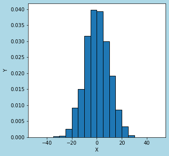
> plt.hist(x, bins=20, range=(-50, 50), density=True, ec='black')
The argument "ec" is used to add a border.
How to Plot Multiple Histograms
I show how to plot multiple histograms.
Here are two ways.
- Plot multiple histograms side by side
- Plot multiple histograms on top of each other
How to plot multiple histograms side by side
I show how to plot multiple histograms side by side.
Specify data in list type as an argument to "matplotlib.pyplot.hist".
This is the example code.
import numpy as np
import matplotlib.pyplot as plt

x1 = np.random.normal(0, 10, 1000)
x2 = np.random.normal(20, 20, 1000)


fig = plt.figure(figsize = (5,5), facecolor='lightblue')

plt.xlabel('X')
plt.ylabel('Y')

plt.hist([x1, x2],  bins=30, range=(-50, 100), ec='black', label=['x1', 'x2'])

plt.show()
The above code generates the following graph.
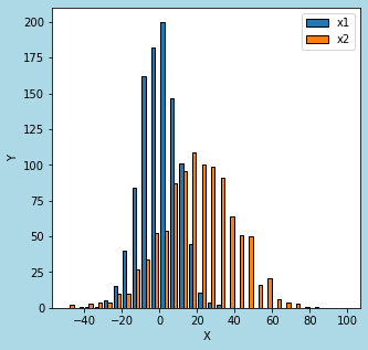
> plt.hist([x1, x2], bins=30, range=(-50, 100), ec='black', label=['x1', 'x2'])
Specify data in list type as an argument.
How to plot multiple histograms on top of each other
I show how to plot multiple histograms on top of each other.
This is the example code.
import numpy as np
import matplotlib.pyplot as plt

x1 = np.random.normal(0, 10, 1000)
x2 = np.random.normal(20, 20, 1000)


fig = plt.figure(figsize = (5,5), facecolor='lightblue')

plt.xlabel('X')
plt.ylabel('Y')

plt.hist(x1,  bins=30, range=(-50, 100), ec='black', alpha = 0.5, label='x1')
plt.hist(x2,  bins=30, range=(-50, 100), ec='black', alpha = 0.5, label='x2')

plt.show()
The above code generates the following graph.
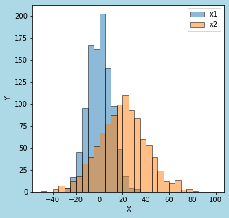
> plt.hist(x1, bins=30, range=(-50, 100), ec='black', alpha = 0.5, label='x1')
> plt.hist(x2, bins=30, range=(-50, 100), ec='black', alpha = 0.5, label='x2')
"plt.hist" are written for each histogram to be plotted.
The argument "alpha" is used to specify transparency.
sponsored link