This article shows how to add a legend for a graph in matplotlib.
Contents
- How to add legend
- How to display the legend horizontally
- How to change the legend position
- How to place the legend outside of the plot
- How to change legend font size
- How to change legend font
First, I will show you how to add a legend as a basic introduction.
After that, I will show you how to adjust the details of a legend, such as how to specify the position and change the font size.
sponsored link
How to add legend
In the beginning, I show how to add legend.
The following two ways are explained below.
- Using "label" in plot function
- Using "legend function"
Using "label" in plot function
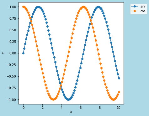
I show how to add the legend using "label" in plot function.
In the plot function, you can specify the legend string by using the "label" argument.
This is the example code.
import numpy as np
import matplotlib.pyplot as plt


x = np.linspace(0, 10, 100)

y1 = np.sin(x)
y2 = np.cos(x)


fig = plt.figure(figsize = (6,6), facecolor='lightblue')
ax1 = fig.add_subplot(1, 1, 1)

ax1.plot(x, y1, linestyle='solid', marker='o', label='sin')
ax1.plot(x, y2, linestyle='solid', marker='o', label='cos')

ax1.set_xlabel('X')
ax1.set_ylabel('Y')

ax1.legend()

plt.show()
The above code generates the following graph.
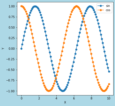
> ax1.plot(x, y1, linestyle='solid', marker='o', label='sin')
label='sin' : Specify a string to be displayed as a legend.
ax1.legend( )
Add the legend using legend function.
Using "legend function"
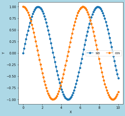
I show how to add the legend using "legend function".
This is the example code.
import numpy as np
import matplotlib.pyplot as plt


x = np.linspace(0, 10, 100)

y1 = np.sin(x)
y2 = np.cos(x)


fig = plt.figure(figsize = (6,6), facecolor='lightblue')
ax1 = fig.add_subplot(1, 1, 1)

ax1.plot(x, y1, linestyle='solid', marker='o')
ax1.plot(x, y2, linestyle='solid', marker='o')

ax1.set_xlabel('X')
ax1.set_ylabel('Y')

ax1.legend(['sin', 'cos'])

plt.show()
The above code generates the following graph. (The same graph in the section above.)
> ax1.legend(['sin', 'cos'])
Specify a string to be displayed as a legend.
sponsored link
How to display the legend horizontally
I show how to display the legend horizontally.
You can specify the number of columns in the legend by using "ncol" argument.
This is the example code.
import numpy as np
import matplotlib.pyplot as plt


x = np.linspace(0, 10, 100)

y1 = np.sin(x)
y2 = np.cos(x)


fig = plt.figure(figsize = (6,6), facecolor='lightblue')
ax1 = fig.add_subplot(1, 1, 1)

ax1.plot(x, y1, linestyle='solid', marker='o', label='sin')
ax1.plot(x, y2, linestyle='solid', marker='o', label='cos')

ax1.set_xlabel('X')
ax1.set_ylabel('Y')

ax1.legend(ncol=2)

plt.show()
The above code generates the following graph.
> ax1.legend(ncol=2)
To display the legend in two columns, "ncol=2" is specified.
How to change the legend position
I show how to change the legend position.
The following three ways are explained below.
- Using "loc=( x, y )"
- Specified by "loc = location"
- Specified by "loc" and "bbox_to_anchor"
Using "loc=( x, y )"
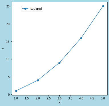
I show how to change the legend position using "loc=( x, y )".
You can specify the legend position with the bottom left as (0,0).
This is the example code.
import matplotlib.pyplot as plt
data_x = [1,2,3,4,5]
data_y = [x*x for x in data_x]
fig = plt.figure(figsize = (6,6), facecolor='lightblue')
ax1 = fig.add_subplot(1, 1, 1)
ax1.plot(data_x, data_y, linestyle='solid', marker='o', label='squared')
ax1.set_xlabel('X')
ax1.set_ylabel('Y')
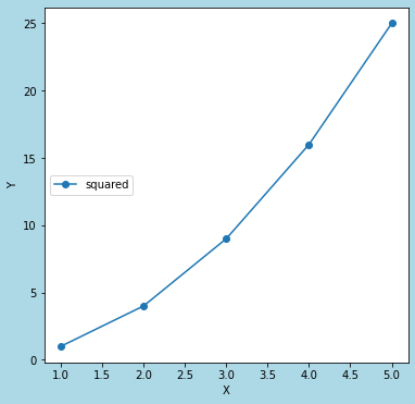
ax1.legend(loc=(0.1, 0.9))
plt.show()The above code generates the following graph.
◆ loc = (0.1, 0.9)
◆ loc = (0.6, 0.9)
> ax1.legend(loc=(0.1, 0.9))
As an argument of the legend function, "loc=(x,y)" is specified.
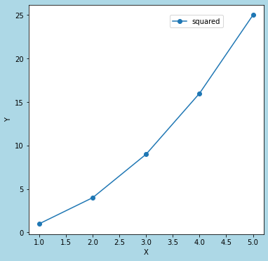
Using "loc = location"
I show how to change the legend position using "loc = location".
This is the example code.
import matplotlib.pyplot as plt
locs = [
'upper left',
'upper right',
'lower left',
'lower right',
'center left',
'center right',
'upper center',
'lower center',
'center',
'best',
'right',
]
data_x = [1,2,3,4,5]
data_y = [x*x for x in data_x]
fig = plt.figure(figsize = (6,6), facecolor='lightblue')
ax1 = fig.add_subplot(1, 1, 1)
ax1.plot(data_x, data_y, linestyle='solid', marker='o', label='squared')
ax1.set_xlabel('X')
ax1.set_ylabel('Y')
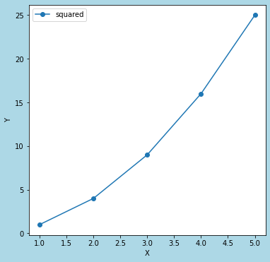
ax1.legend(loc=locs[4])
plt.show()The above code generates the following graph.
> ax1.legend(loc=locs[4])
As an argument of the legend function, "loc = location" is specified.
In above example code, location is "center left".
Using "loc" and "bbox_to_anchor"
I show how to change the legend position using "loc" and "bbox_to_anchor".
You can specify the legend position by specifying a range using "bbox_to_anchor" and a relative position using "loc".
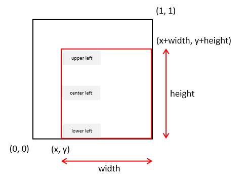
Specify a range : "bbox_to_anchor = ( x, y, width, height )"
Specify a relative position : "loc = location"
This is the example code.
import matplotlib.pyplot as plt

locs = [
    'upper left',
    'upper right',
    'lower left',
    'lower right',
    'center left',
    'center right',
    'upper center',
    'lower center',
    'center',
    'best',
    'right',
]

data_x = [1,2,3,4,5]
data_y = [x*x for x in data_x]


fig = plt.figure(figsize = (6,6), facecolor='lightblue')
ax1 = fig.add_subplot(1, 1, 1)

ax1.plot(data_x, data_y, linestyle='solid', marker='o', label='squared')

ax1.set_xlabel('X')
ax1.set_ylabel('Y')

ax1.legend(loc=locs[0], bbox_to_anchor=(0, 0, 1, 1))

plt.show()
The above code generates the following graph.
◆ bbox_to_anchor=(0, 0, 1, 1), loc = "upper left"
◆ bbox_to_anchor=(0.5, 0, 0.5, 1), loc = "center left"
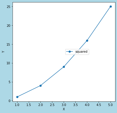
> ax1.legend(loc=locs[0], bbox_to_anchor=(0, 0, 1, 1))
As an argument of the legend function, "loc" and "bbox_to_anchor" are specified.
In above example code, loc" is "upper left".
sponsored link
How to place the legend outside of the plot
I show how to place the legend outside of the plot.
This is the example code.
import matplotlib.pyplot as plt

locs = [
    'upper left',
    'upper right',
    'lower left',
    'lower right',
    'center left',
    'center right',
    'upper center',
    'lower center',
    'center',
    'best',
    'right',
]

y1 = np.sin(x)
y2 = np.cos(x)


fig = plt.figure(figsize = (6,6), facecolor='lightblue')
ax1 = fig.add_subplot(1, 1, 1)

ax1.plot(x, y1, linestyle='solid', marker='o', label='sin')
ax1.plot(x, y2, linestyle='solid', marker='o', label='cos')

ax1.set_xlabel('X')
ax1.set_ylabel('Y')

ax1.legend(loc=locs[0], bbox_to_anchor=(1.05, 1.0))

plt.show()
The above code generates the following graph.
> ax1.legend(loc=locs[0], bbox_to_anchor=(1.05, 1.0))
"bbox_to_anchor=(1.05, 1.0)" is specified so that the legend is placed outside the plot.
How to change legend font size
I show how to change legend font size.
You can change legend font size by using "fontsize" argument.
This is the example code.
import matplotlib.pyplot as plt


y1 = np.sin(x)
y2 = np.cos(x)


fig = plt.figure(figsize = (6,6), facecolor='lightblue')
ax1 = fig.add_subplot(1, 1, 1)

ax1.plot(x, y1, linestyle='solid', marker='o', label='sin')
ax1.plot(x, y2, linestyle='solid', marker='o', label='cos')

ax1.set_xlabel('X')
ax1.set_ylabel('Y')

ax1.legend(fontsize=20)

plt.show()
The above code generates the following graph.
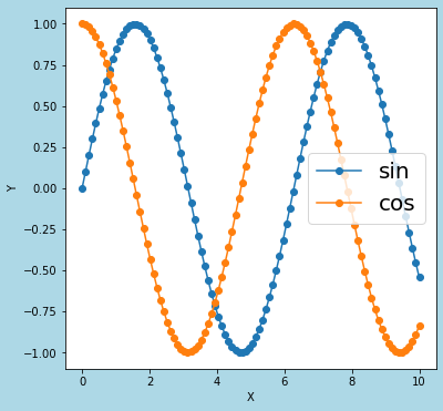
> ax1.legend(fontsize=20)
The legend font size is changed by passing fontsize=20 as an argument.
sponsored link
How to change legend font
I show how to change legend font.
The fonts available in matplotlib are listed in the following files.
C:/Users/"User name"/.matplotlib/fontlist-v330.json

The font name is "name" in the above file.
You can change legend font, by specifying a dictionary whose key is "familly" and whose value is "the font name" in the argument prop.
This is the example code.
import matplotlib.pyplot as plt


y1 = np.sin(x)
y2 = np.cos(x)


fig = plt.figure(figsize = (6,6), facecolor='lightblue')
ax1 = fig.add_subplot(1, 1, 1)

ax1.plot(x, y1, linestyle='solid', marker='o', label='sin')
ax1.plot(x, y2, linestyle='solid', marker='o', label='cos')

ax1.set_xlabel('X')
ax1.set_ylabel('Y')

ax1.legend(prop={'family':'Courier New'})

plt.show()
The above code generates the following graph.

> ax1.legend(prop={'family':'Courier New'})
The font is changed to Courier New.
The following article explains that the list of fonts available in matplotlib.
sponsored link