This article shows how to create a bar plot in matplotlib.
Contents
- How to Create a Bar Plot
- How to Set Bar Width
- How to Set Bar Color
- How to Add Edge of Bar
- How to Plot Multiple Bar Plots
- How to Create a Stacked Bar Plot
sponsored link
How to create a bar plot
In the beginning, I show how to create a bar plot.
Matplotlib provides methods for drawing a bar plot.
The way to use of "matplotlib.pyplot.bar" is described in matplotlib documentation.
matplotlib documentation
This is the example code to create a bar plot using "matplotlib.pyplot.bar".
import numpy as np
import matplotlib.pyplot as plt
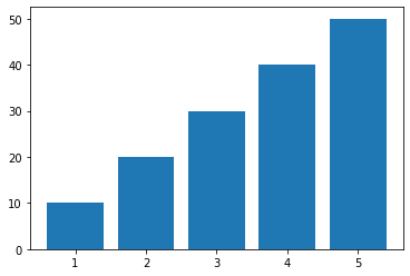
x = np.array([1, 2, 3, 4, 5])
y = np.array([10, 20, 30, 40, 50])
plt.bar(x, y)
plt.show()The above code generates the following graph.
> plt.bar(x, y)
The variables "x" and "y" are data lists for bar plot generation.
Example of adding graph elements to a bar plot
I show example of adding axis labels, legends etc. to a bar plot.
This is the example code.
import numpy as np
import matplotlib.pyplot as plt
x = np.array([1, 2, 3, 4, 5])
y = np.array([10, 20, 30, 40, 50])
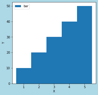
fig = plt.figure(figsize = (5,5), facecolor='lightblue')
plt.xlabel('X')
plt.ylabel('Y')
plt.bar(x, y, label='bar')
plt.legend()
plt.show()The above code generates the following graph.
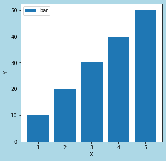
> fig = plt.figure(figsize = (5,5), facecolor='lightblue')
A figure object is created.
> plt.xlabel('X')
> plt.ylabel('Y')
Axis labels are added.
The following article explains how to set axis elements.
How to Set Axis Elements[Label, Range, Ticks]
> plt.bar(x, y, label='bar')
The "label=" argument is used to specify the legend string.
The following article explains how to add legend.
sponsored link
How to Set Bar Width
I show how to set bar width.
You can change bar width by specifying "width=" as an argument.
This is the example code.
import numpy as np
import matplotlib.pyplot as plt

x = np.array([1, 2, 3, 4, 5])
y = np.array([10, 20, 30, 40, 50])


fig = plt.figure(figsize = (5,5), facecolor='lightblue')

plt.xlabel('X')
plt.ylabel('Y')

plt.bar(x, y, label='bar', width=0.1)

plt.legend()

plt.show()
The above code generates the following graph.
◆width=0.1
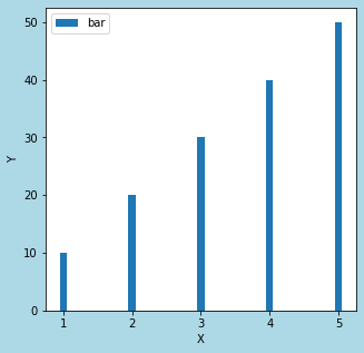
◆width=1
> plt.bar(x, y, label='bar', width=0.1)
The bar width is changed by specifying the argument "width="
How to Set Bar Color
I show how to set bar color.
You can change bar color by specifying "color=" as an argument.
This is the example code.
import numpy as np
import matplotlib.pyplot as plt

x = np.array([1, 2, 3, 4, 5])
y = np.array([10, 20, 30, 40, 50])


fig = plt.figure(figsize = (5,5), facecolor='lightblue')

plt.xlabel('X')
plt.ylabel('Y')

plt.bar(x, y, label='bar', width=0.8, color='GreenYellow')

plt.legend()

plt.show()
The above code generates the following graph.
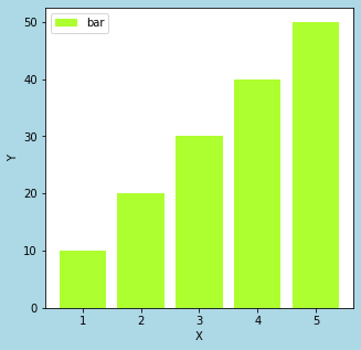
> plt.bar(x, y, label='bar', width=0.8, color='GreenYellow')
The bar color is changed by specifying the argument "color="
sponsored link
How to Add Edge of Bar
I show how to add edge of bar.
You can add edge of bar by specifying "edgecolor=" as an argument.
This is the example code.
import numpy as np
import matplotlib.pyplot as plt

x = np.array([1, 2, 3, 4, 5])
y = np.array([10, 20, 30, 40, 50])


fig = plt.figure(figsize = (5,5), facecolor='lightblue')

plt.xlabel('X')
plt.ylabel('Y')

plt.bar(x, y, label='bar', width=0.8, color='GreenYellow', edgecolor='Green')

plt.legend()

plt.show()
The above code generates the following graph.
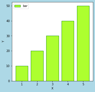
> plt.bar(x, y, label='bar', width=0.8, color='GreenYellow', edgecolor='Green')
The color of bar edge is changed by specifying the argument "edgecolor="
How to Set Edge Width of Bar Plot
I show how to set edge width of bar plot.
You can set edge width by specifying "linewidth=" as an argument.
This is the example code.
import numpy as np
import matplotlib.pyplot as plt

x = np.array([1, 2, 3, 4, 5])
y = np.array([10, 20, 30, 40, 50])


fig = plt.figure(figsize = (5,5), facecolor='lightblue')

plt.xlabel('X')
plt.ylabel('Y')

plt.bar(x, y, label='bar', width=0.8, color='GreenYellow', edgecolor='Green', linewidth=5)

plt.legend()

plt.show()
The above code generates the following graph.
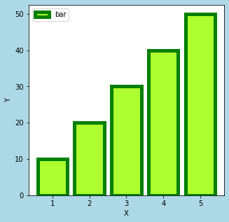
> plt.bar(x, y, label='bar', width=0.8, color='GreenYellow', edgecolor='Green', linewidth=5)
The edge width is changed by specifying the argument "linewidth="
sponsored link
How to Plot Multiple Bar Plots
I show how to plot multiple bar plots.
To plot the two bars side by side, the x-axis elements are shifted by half its width.
This is the example code.
import numpy as np
import matplotlib.pyplot as plt


width_bar = 0.4

x = np.array([1, 2, 3, 4, 5])
x1 = x - width_bar/2
x2 = x + width_bar/2

y1 = np.array([10, 20, 30, 40, 50])
y2 = np.array([10, 15, 10, 15, 10])


fig = plt.figure(figsize = (5,5), facecolor='lightblue')

plt.xlabel('X')
plt.ylabel('Y')

plt.bar(x1, y1, label='y1', width=width_bar, align="center")
plt.bar(x2, y2, label='y2', width=width_bar, align="center")

plt.legend()

plt.show()
The above code generates the following graph.
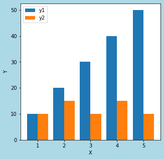
> x = np.array([1, 2, 3, 4, 5])
> x1 = x - width_bar/2
> x2 = x + width_bar/2
The x-axis elements are shifted by half its width.
> plt.bar(x1, y1, label='y1', width=width_bar, align="center")
> plt.bar(x2, y2, label='y2', width=width_bar, align="center")
Two bar plots are plotted.
How to Create a Stacked Bar Plot
I show how to create a stacked bar plot.
You can create a stacked bar plot by specifying "bottom=" as an argument.
This is the example code.
import numpy as np
import matplotlib.pyplot as plt


width_bar = 0.8

x = np.array([1, 2, 3, 4, 5])

y1 = np.array([10, 20, 30, 40, 50])
y2 = np.array([10, 15, 10, 15, 10])


fig = plt.figure(figsize = (5,5), facecolor='lightblue')

plt.xlabel('X')
plt.ylabel('Y')

plt.bar(x, y1, label='y1', width=width_bar, align="center")
plt.bar(x, y2, label='y2', width=width_bar, align="center",bottom=y1)

plt.legend()

plt.show()
The above code generates the following graph.
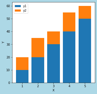
> plt.bar(x, y1, label='y1', width=width_bar, align="center")
> plt.bar(x, y2, label='y2', width=width_bar, align="center",bottom=y1
By specifying "bottom=y1", The bar "y2" can be stacked on top of the bar "y1".
sponsored link